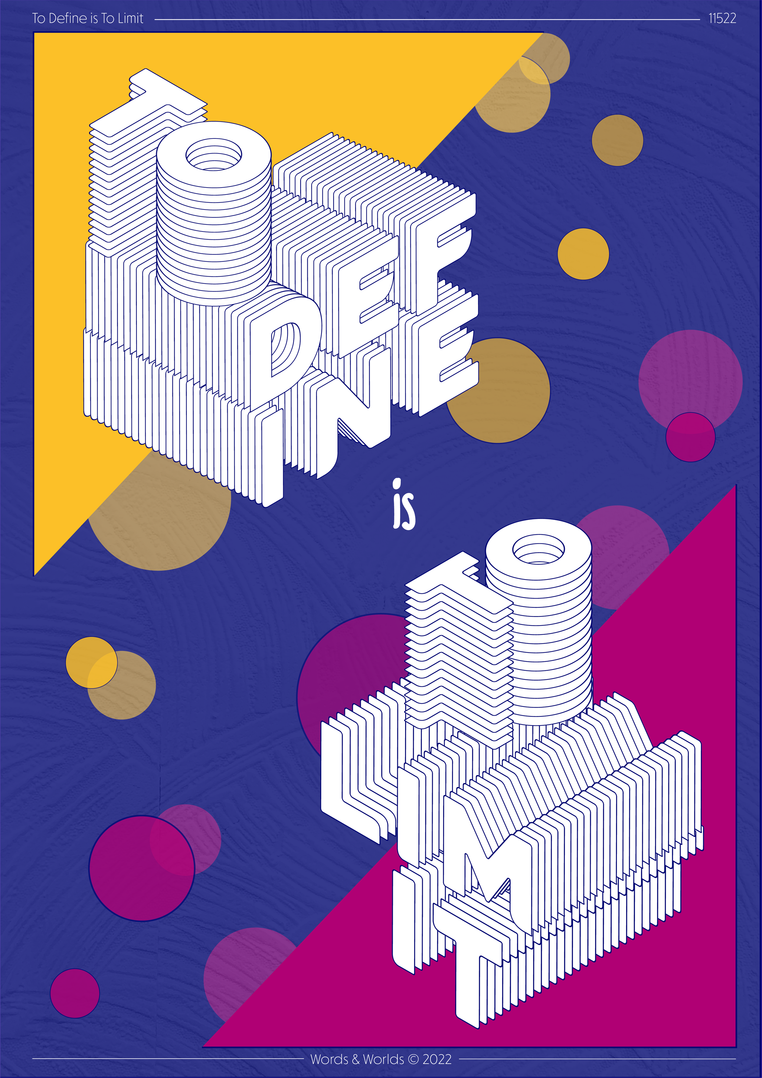
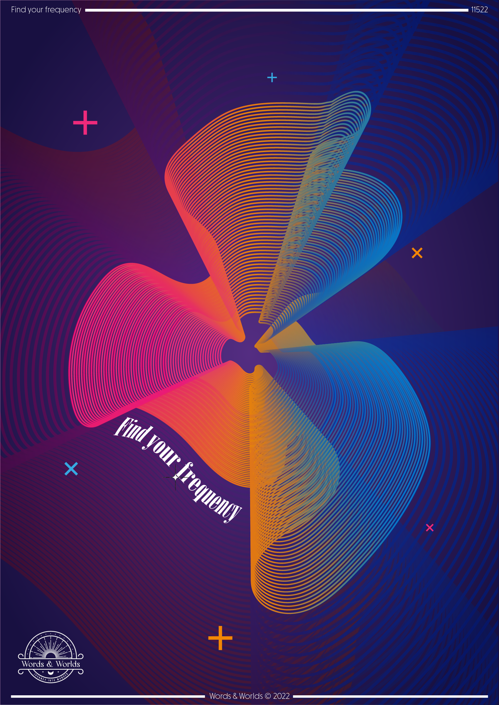
Typography Posters
This is my second project and it all started with my fascination with typography and clever wordplay. I love solid colours, bold and somehow disruptive designs, and I especially enjoy seeing the clever use of words and copy to create feelings. Partner that with my greater appreciation (and understanding!) for putting together colour palettes and I’m now moving into a whole new chapter of design that’s pushing my creativity! And you know what, creating posters is just really cool so I’m going with the flow and seeing what I can create!
I’ve already learnt so much but I’m still developing my approach and style - and I owe a lot to the creators on Skillshare for sharing their tutorials and helping me create cool pieces. Big shout out to Marcos Silva too for his poster design classes and making it super easy to follow and giving me the inspiration to kick start my design process - check out his Instagram here.
I’ll be sharing new posters every few weeks and if you’re interested in any designs or any quotes that I use then get in touch because I’ll be making these available for print and frame very soon! And as always I’d love to hear your suggestions for new designs or things that inspire you - you never know, I could end up creating something that’s made just for you!
Stay tuned!


